A kitchen can look beautiful in three samples and feel completely different once those samples cover the room. A blue tile that seemed quiet on the table becomes a luminous wall; a small marble cutting becomes the busiest surface in sight. Choosing kitchen materials is partly a question of proportion—and partly a question of what you want to live with every day.
These four Maison Matière combinations take the same starting idea in different directions: coastal lightness, English-country warmth, Parisian contrast and an urban loft’s wood-and-metal balance. Each has a clear material relationship. Use the one you love as a starting point, then adjust it around your existing floor, daylight, cooking habits and budget.
Rooms, material boards and details are Maison Matière interior concepts. They illustrate a design direction rather than a specified installation or an exact retailer product.
Start with the surface you are keeping
Before choosing a style, identify your fixed starting point. It might be an oak floor, serviceable white cabinetry or a worktop you cannot justify replacing. Take a sample or a clear daylight photograph of it when you shop. Choosing three new materials in isolation often produces a fourth, awkward relationship when they meet what is already there.
Next, give one surface the leading role. If the stone has dramatic movement, quieter cabinet fronts let you see it. If botanical wallpaper brings the pattern, the worktop can be a calm dark plane. A kitchen does not need every material to make a separate statement.
Finally, settle the layout before approving finishes. A beautifully veined counter cannot compensate for a blocked appliance door or unusable seating. Our kitchen layout and dimensions guide helps you check the practical arrangement first.
Four combinations at a glance
- Coastal
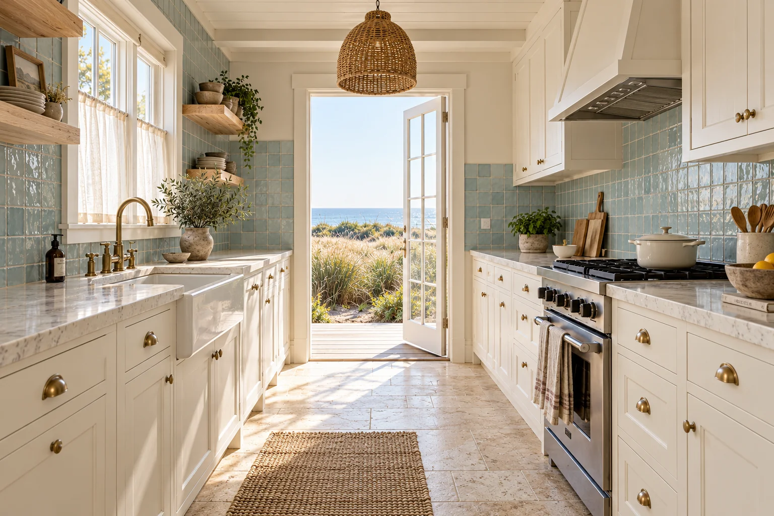
- Warm white wood, sea-glass-blue tile and pale limestone. Let the backsplash carry the colour.
- English country
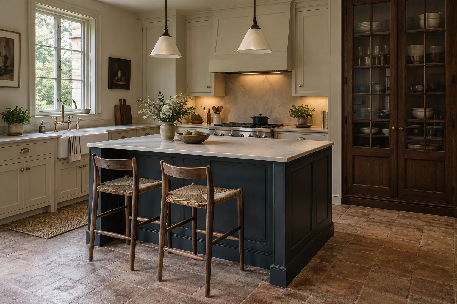
- Cream cabinetry, dark botanical wallpaper and charcoal soapstone. Keep pattern on a carefully chosen wall.
- Parisian
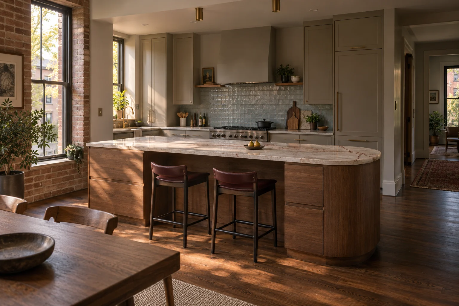
- Ink-blue cabinetry, cream-and-burgundy marble and oak herringbone. Give the stone room to lead.
- Urban loft
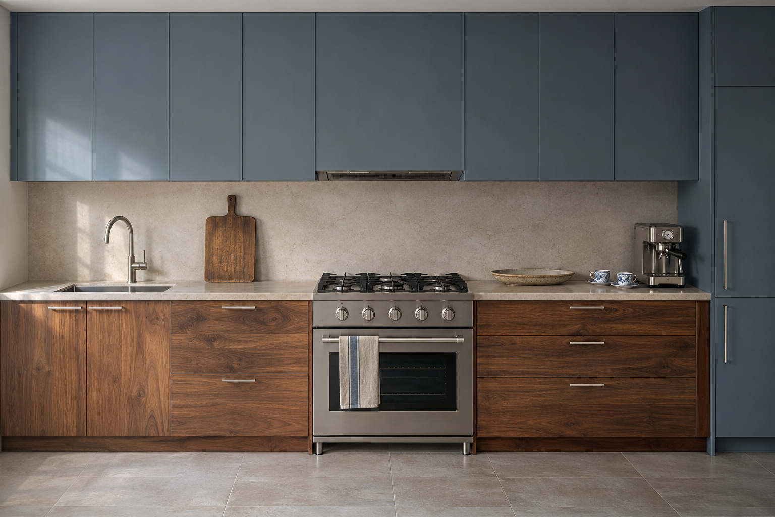
- Walnut, brushed steel and dark terrazzo. Balance warm grain with a cooler working surface.
1. Coastal: warm white, sea-glass blue and pale limestone
The appeal here is the change in texture: painted wood feels quiet, glazed tile catches light, and the pale floor anchors both. The blue belongs to the backsplash, rather than being repeated on every cabinet and accessory. That limited placement keeps the room relaxed.

- Left: warm white painted wood
- Centre: sea-glass-blue glazed tile
- Right: pale limestone
Make the whites work together
Look at the cabinet paint beside the floor, grout and worktop. A sharp cool white can make a warm limestone look unexpectedly yellow. Start with the stone’s undertone and test a softer white nearby. The blue can lean slightly green without requiring green elsewhere in the room.
For a smaller kitchen, keep the tile to the working wall and leave another wall quiet. Glossy tile will respond differently to daylight and evening lamps; check it under both. “Sea-glass” describes the colour here—the concept uses glazed square tile, while actual glass mosaic would have a different surface and more grout joints.

Know which kind of upkeep you are choosing
Limestone is a natural-stone commitment, not just a beige colour choice. Many limestones contain calcium carbonate, which is vulnerable to acidic spills and cleaners. An impregnating sealer can improve stain resistance; it does not make stone stain-proof or prevent acid etching. Ask the supplier about the exact stone, finish and recommended care. The Natural Stone Institute’s care guidance explains the distinction.
If the appearance appeals but that care does not, compare a limestone-look porcelain floor in person. Judge its pattern repeats, edge and texture rather than assuming it will read like the natural material. For a modest refresh, retain plain cabinets and change a backsplash you were already planning to replace. The lighter mineral-and-linen relationships in our modern Mediterranean guide offer another way to develop the palette.
2. English country: cream, botanical pattern and soapstone

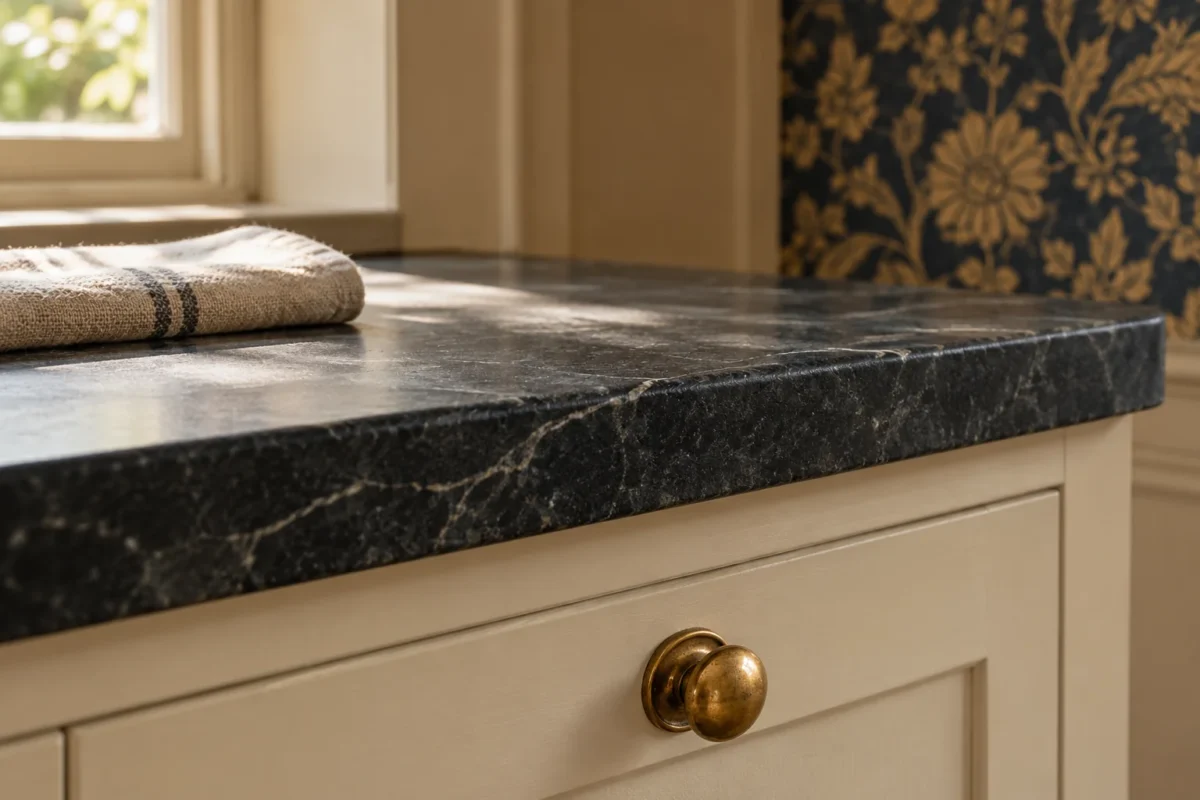
This combination creates a kitchen that feels connected to a dining room. Cream cabinetry provides a generous quiet area, charcoal soapstone gives the work zone definition, and a dark botanical paper makes a nearby wall feel furnished. The country character comes from those relationships, not from adding rustic objects to every surface.

- Left: cream painted cabinetry
- Centre: indigo-and-ochre botanical paper
- Right: charcoal soapstone
Place the wallpaper where you can enjoy it
Our concept places the paper on the dry dining wall, away from the sink and cooking area. A wall seen across the room can carry a larger repeat; a thin strip between wall cabinets may crop it into fragments. Check a full pattern repeat against the wall’s actual dimensions before ordering.
Keep a practical, specified backsplash where splashes and heat occur. Wallpaper suitability depends on the particular product, its washability and the location; a botanical print is not automatically a kitchen finish. If you rent or want less commitment, bring the pattern through a framed textile or removable decorative element outside the working zone.
Decide how dark you want the stone to become
Soapstone’s appearance can change with water, oils and use. Vermont Soapstone describes mineral oil as a way to even and deepen that appearance, with upkeep depending on the owner’s preference. Ask your fabricator to show the chosen stone dry and with its proposed treatment, and provide the care routine in writing. See Vermont Soapstone’s care notes for that supplier’s approach.
Before specifying a dark worktop, view it beside the cream under evening lighting. You want a deliberate contrast, not a counter that disappears into shadow. Existing cream cabinetry can be a strong starting point: one patterned dining wall and considered hardware may be enough to change the room’s character. Our modern rustic materials guide explores a related balance of expressive texture and quieter surfaces.
3. Parisian: ink blue, expressive marble and oak herringbone

Here, the marble is the main event. Burgundy movement through a creamy stone creates a strong pattern; ink-blue cabinetry frames it, and golden oak brings warmth below. The Parisian name is a mood for this composition, rather than a rule about how a Paris kitchen must look.

- Left: ink-blue painted wood
- Centre: cream-and-burgundy marble
- Right: oak herringbone
Choose the slab before perfecting the paint
A small marble sample cannot show how large fragments or veins will cross a long worktop. Inspect the actual slab, then ask for the proposed cut layout, including seams, sink cutout and backsplash pieces. Decide whether you want the stone’s movement to continue upward or stop at a restrained upstand.
The cabinet colour does not need to match a vein exactly. It needs to sit comfortably beside the stone’s overall temperature and remain attractive under your room’s light. Simple door profiles and restrained handles help avoid a competition between joinery detail, marble pattern and parquet.

Choose this for a surface you will let age
Marble can etch from acidic substances; sealing and etching are different questions. If a changing surface would bother you every time you prepare food, make that part of the decision now. Ask to see a used example of the exact finish, or compare another specified material for the main preparation area. A quiet countertop paired with a smaller decorative marble element can preserve the colour relationship.
Oak flooring also brings its own routine. The National Wood Flooring Association recommends promptly cleaning spills and avoiding wet or steam mops; follow the flooring manufacturer’s instructions for the particular finish. Include transitions, thresholds and installation in your quote. Herringbone’s visual rhythm is worth considering alongside the fabrication and fitting work, not just the price of the boards.
If you already have oak flooring, an ink-blue cabinet refresh may deliver the greatest visual change. For an open-plan room, carry one related tone into the adjoining space instead of repeating the complete kitchen palette. Our nature-inspired colour guide explains how to build those connections.
4. Urban loft: walnut, brushed steel and dark terrazzo

Walnut supplies warmth and long lines of grain; brushed steel provides a cooler, more reflective working plane; terrazzo breaks up the floor with irregular aggregate. The contrast matters more than the industrial label. This combination can work in a modern apartment without exposed brick or factory windows.

- Left: walnut
- Centre: brushed stainless steel
- Right: dark terrazzo
Control grain, shine and pattern
Request a cabinet sample that shows the real veneer and finish, then discuss grain direction across drawers and tall doors. A tiny walnut cutting cannot tell you how adjacent fronts will relate. Against that larger expanse of wood, directional brushed steel keeps the counter visually distinct without the sharp reflections of a mirror finish.
Choose terrazzo by its background as well as its chips. A very busy mix can compete with active walnut grain. In a compact room, compare smaller and larger aggregates from the doorway—the floor should support the composition at that distance.

Ask to see the working finish
A pristine steel sample may not tell you whether you will enjoy the fine marks a working counter acquires. Ask the fabricator about the grade, finish, cleaning instructions, edge construction, support and joints. View a used surface if possible. There is no useful universal promise that every steel worktop will feel or age the same.
For the floor, establish what you are buying. The National Terrazzo & Mosaic Association describes terrazzo as aggregate in a cementitious or epoxy binder. Terrazzo-look porcelain is a different product. Ask about the proposed system, finish, cleaning, sealing where applicable, and suitability for the location.
For a smaller project, keep existing timber cabinets and introduce steel only where a counter replacement makes sense. A terrazzo pattern does not need to cover the whole floor to establish the relationship. A sample seen beside the actual walnut will tell you more than another saved mood image.
Make a sample board that can answer a question
The boards above show the ingredients clearly. Your own board should test the materials you can actually order. Lay the floor sample flat, stand the cabinet sample upright and put the backsplash above the worktop cutting. Equal-sized samples can disguise the fact that one surface will occupy most of your kitchen.
If the cabinets are still undecided, our guide to wood kitchen cabinets helps you compare grain, construction and finishes before settling the surrounding palette.
Five checks before you commit
- Light
- Move samples into the kitchen. Compare morning, afternoon and your usual evening lighting.
- Undertones
- View paint beside stone, grout and existing trim. Check each junction, not just the separate colours.
- Scale
- See the full wallpaper repeat, several tiles, an actual slab and representative wood grain.
- Daily use
- Request the exact product’s maintenance instructions and understand the appearance changes you will accept.
- Whole cost
- Compare written quotes including substrate preparation, installation, fabrication, edges, seams, delivery and spare material.
Do not rank these four combinations by the cost of a single tile or slab. Existing conditions and the extent of the work can change the order completely. Reserve money for the material you touch or see most, then simplify a supporting surface. A carefully finished plain cabinet can be more convincing than an elaborate material mix fitted poorly.
A small US materials edit
Start with samples and product information rather than a full order. These are sourcing options to compare, not exact matches to our concepts or products we have tested. Links are ordinary retailer links; Maison Matière currently receives no affiliate commission from them.
Paint: test a blue-grey direction
Benjamin Moore Soft Chinchilla peel-and-stick sample is one blue-grey starting point for the coastal direction, not an ink-blue match. Its movable sample helps you compare different walls. Confirm the final coating system and sheen for your cabinetry separately; an eggshell colour sample does not specify a cabinet finish.
Tile: compare a glass-mosaic alternative
TileBar Splash Tropical Blue glass-mosaic sample offers a blue-green alternative to the larger glazed squares in our concept. Check the smaller format, grout pattern and glass reflections in your kitchen, then review the installation requirements with your installer.
Wallpaper: study the repeat before covering the wall
GP & J Baker Lorelle wallpaper at Lulu and Georgia is a botanical direction to investigate for a suitable dry wall. Compare the actual colourway, repeat, quantity and hanging instructions. The listing describes it as made to order; read the current return terms and ask about a sample or cutting before committing.
Watch the four combinations
Watch the short Maison Matière film, then return to the material details above. Which relationship do you love—and which maintenance routine would you realistically choose?
A useful final choice can be expressed in one sentence: I am keeping this surface, letting this material lead, and choosing these quieter finishes around it. That is a firmer starting point than collecting four beautiful materials and hoping they become a kitchen.
Once the material relationship feels right, decide how the island belongs in the room. Our kitchen island ideas in stone, wood and curved shapes compare seating, storage and alternatives for a narrower kitchen.
Start with one change, photograph the room and check how it feels in daily use before adding another.