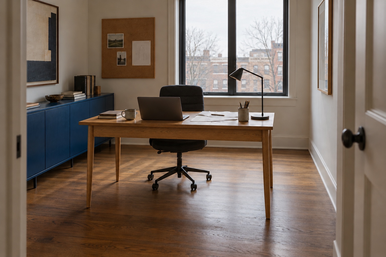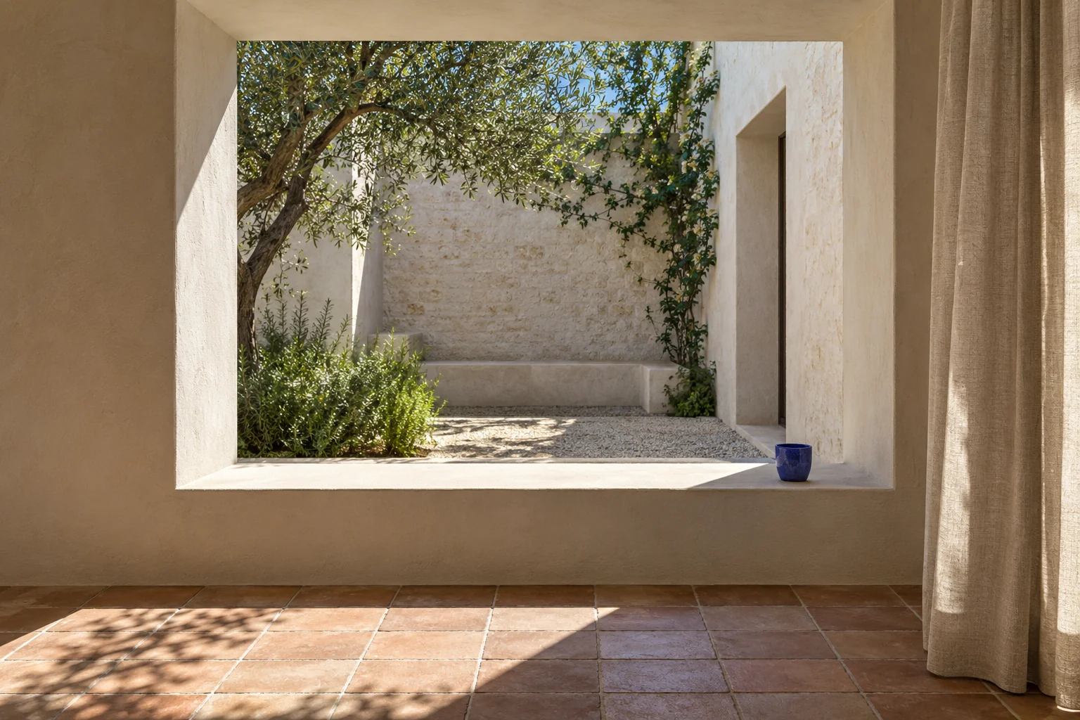
Modern Mediterranean interior design is most convincing when it responds to the room: how daylight enters, where people sit, what they touch and how the space connects to outdoors. Pale walls and a terracotta bowl are a starting point, but they cannot do that work on their own.
The Mediterranean includes many different places and design traditions. This guide draws on a contemporary vocabulary of light, shade, clay, timber and textiles; it is not a recipe for an “authentic” regional home. The useful question is which of those relationships can improve the home you actually have.
The images are Maison Matière interior concepts showing different spaces and details. They are not documented properties or images of the shopping products. The diagrams explain choices, not construction details, thermal performance or measured light levels.
A contemporary approach to a diverse design vocabulary

A room can feel Mediterranean-inspired through a quiet relationship between a shaded opening, tactile walls, timber furniture and a few stronger colours. The contemporary part comes from resolving those elements simply and arranging the furniture for the people who use it.
Cosentino’s overview of contemporary Mediterranean design discusses regional influences, material texture and connections between inside and outside. Our suggestions interpret those themes for everyday rooms, rather than claiming that one set of finishes represents every Mediterranean home.
Some rooms will suit a largely pale palette; others benefit from clay red, blue, green or darker timber. You do not need to remove a favourite piece because it falls outside a mood board. Start by finding a place for it in the arrangement.
Work with light and shade as separate needs
Choose the job before the fabric
- Daylight
- Hold a sample at the actual window. Check the light and view you want to keep.
- Direct sun
- Test glare from the sofa at the time you use the room. A sheer may need a second layer.
- Evening privacy
- With indoor lights on, check from outside. Sheer linen alone may reveal the interior.
Direct sun, filtered daylight and evening privacy call for different decisions. A sheer or light-filtering curtain can soften the view into the room, while a separate opaque layer may be needed at night. Judge the window from both sides when privacy matters.
Keep a window treatment’s operation clear. Curtains need room to stack back, blinds need an appropriate fixing and accessible controls, and furniture should not prevent a window or door opening. A good photograph should reflect those relationships; they are worth checking in your own plan before selecting fabric.
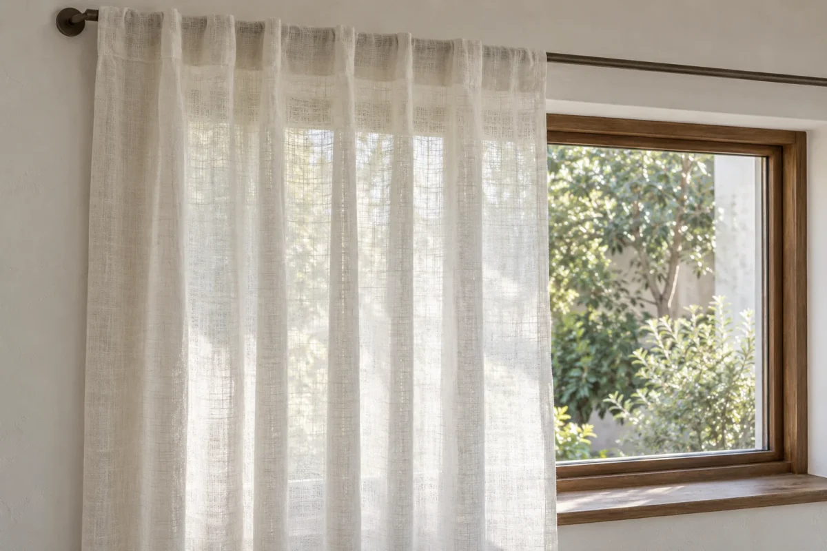
Linen’s visible weave and gentle folds can add texture to an otherwise simple wall. Fibre content alone does not tell you how transparent a curtain will be, however. Compare the actual fabric against daylight, and check the manufacturer’s privacy and care information.
If the view is the strongest feature, frame it with a quieter treatment. If the window faces a neighbouring building, give privacy a larger role. Our living-room curtain guide compares layers, headings and fit. Once daylight fades, use local lighting around the seats to give the room another useful setting.
Choose the wall finish for the surface you have
Separate appearance, substrate and care
- Paint
- Choose the appearance, sheen and a product suited to the surface. Check the preparation instructions.
- Limewash
- Check substrate compatibility and the complete application and maintenance guidance.
- Plaster
- Review the finish system, installer requirements and suitability for the location.
A plain painted wall can be a good foundation for this direction. Its quieter surface leaves room for linen, woven furniture or tile to provide the texture. You do not need a decorative finish on every wall.
Limewash and plaster offer other possibilities, but they are different products and processes. The desired appearance is only one part of the decision: identify the existing substrate, the preparation system, application method and future maintenance before comparing costs.
For example, Bauwerk’s drywall guidance distinguishes priming from its Prep Coat and explains preparation for different wall conditions. That is a reason to follow the chosen manufacturer’s complete system, not to assume a decorative paint can simply go over any existing coating.
Test the finish on a suitable sample or permitted area. Assess it after drying, with the room’s real light and adjacent materials. For a professionally applied plaster, ask to see a physical sample and confirm what the quoted work includes. Do not use a concept illustration as a specification for a contractor.
Clay, wood and textiles: let their differences show
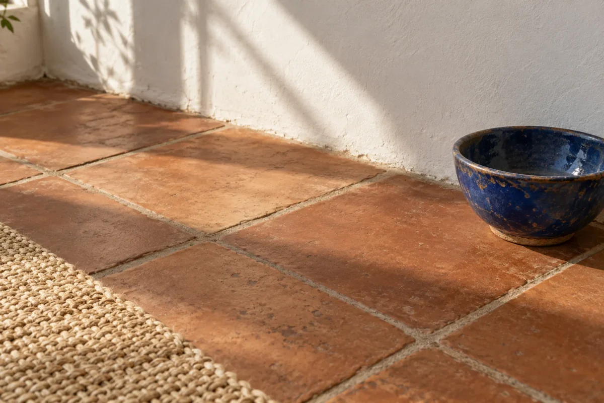
Clay can bring colour and surface variation to a largely pale room. A tiled floor is one way to introduce it, but a textile, a pot or a painted cabinet can provide a smaller colour field. Choose the role before choosing the product.
If you are buying tile, separate the visual sample from the technical questions. Confirm the product’s intended location, maintenance and installation requirements with the supplier. A terracotta appearance may come from fired clay, porcelain or another construction; the photograph does not settle that distinction.
Timber supplies a useful quieter neighbour to a patterned tile or a strongly textured wall. A table with a simple outline allows the grain to show. Mix in textiles with different scales of weave, rather than repeating the same rough surface on every object.
A stronger accent can be deliberately small: cobalt on a shelf, a clay-red tablecloth or one blue stripe on bedding. Repeat it only where it helps the room connect. For a broader palette, see our nature-inspired colour combinations.
Use curves where they solve a design problem
A curved chair back, a round table or the profile of a ceramic bowl can soften a room with many straight edges. Pick the object for its job as well as its shape. A round table can still occupy too much space, and a deep curved chair still needs its full footprint.
Existing arches can be treated simply. You do not need to add a decorative arch to every plain wall to establish the style. In a straightforward apartment, a rectangular window, a light curtain and a well-chosen material combination can be enough.
Keep the arrangement legible. A lounge chair belongs in conversation with other seats or in a useful reading place, with a surface within reach if needed. Leave the route to the window, door or terrace understandable. Our living-room layout guide begins with those everyday relationships.
Three different ways to bring it home
A city apartment: start with textiles and finishes
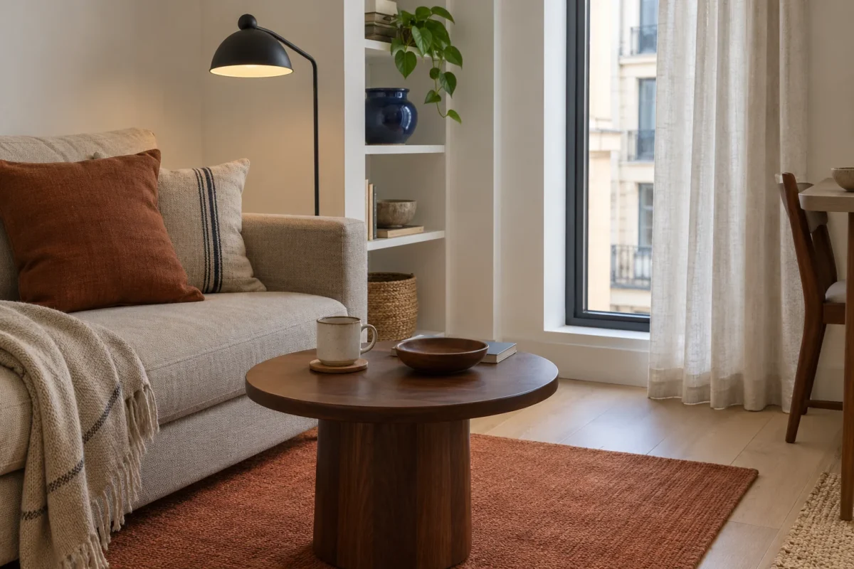
Keep the existing timber floor and plain walls. Try a linen-looking window layer, a clay-coloured rug and one glazed ceramic accent. A darker table or lamp can give the pale upholstery a clearer edge without making the room heavy.
Start with one useful purchase rather than a matching collection. If the sofa already has a good shape and comfortable fabric, keep it. In a rental, check the permission needed for paint and fixings; removable textiles and objects can do much of the visual work.
A bedroom: a lighter backdrop and a grounded bed

Simple bedding, a visible timber frame and a single striped textile can establish the direction without turning the bedroom into a themed set. Keep water, a phone and a book on a stable surface; choose reading lights for the actual pillow position.
Privacy and sleep need their own decisions. A curtain that looks beautiful in daylight may still need a blackout or room-darkening layer. Compare the product’s performance rather than assuming pale linen will provide it. For tight layouts, our small-bedroom guide helps prioritise bedside access and storage.
A dining space: connect the table to the room beyond

A textile across part of the table and everyday ceramic serving pieces can introduce colour without hiding the furniture. Check that dining chairs face the table naturally and have space when pulled out. Centre the pendant on the final table position, not on an arrangement you expect to move later.
Where there is outdoor access, preserve the route. Where there is only a window, keep the connection through the view and daylight instead. Indoor furniture should not be moved outside unless its actual specification permits that use.
Choose a level of change before spending
First, removable layers: test textiles, a useful lamp or a ceramic piece. These are the easiest ways to judge the direction while keeping the major surfaces.
Next, surface work: consider paint or a decorative finish only when it improves the room and suits the existing walls. Include preparation, samples and labour in the budget, not just the finish itself.
Finally, renovation: tile, built-in seating or changes to openings need a complete plan. Settle the practical layout and obtain appropriate professional advice before choosing the decorative detail. The style should guide a useful project, not create a reason to undertake unnecessary work.
Three researched options for US shoppers
These are entry points for textile, ceramic and finish decisions, not a claim that every room needs all three. We have not tested them. Listings were checked on 5 October 2026; confirm the selected variant, stock, care and full cost. These ordinary retailer links currently earn us no commission.
Modern Mediterranean questions
Can this work in a home with no arches or tiled floor?
Yes. Use the relationships between daylight, textiles, timber and a few colour accents. Simple room details can make those choices particularly clear.
How is it different from modern rustic?
The two can overlap. In our modern rustic guide, aged timber and stronger material contrast take the leading role. Here, light, shade and lighter surface relationships lead. These are useful editorial distinctions, not rigid classifications.
What should I change first?
Choose the part that currently fails in use: a window with poor privacy, a seat without useful light, or a rug that does not connect the furniture. Solve that need in the material direction you enjoy. Our rug guide and compact furniture comparisons can help.
Sources and editorial notes
The room concepts, diagrams and staged change sequence are original Maison Matière work. The linked Cosentino overview provides a contemporary design reference; Bauwerk supplies product-specific surface guidance. Curtain and serving-bowl specifications come from the linked US listings. Illustrative light and texture do not establish the performance of a real material or product.
Read our editorial standards and shopping disclosures, or explore more interior design styles.
Start with one change, photograph the room and check how it feels in daily use before adding another.