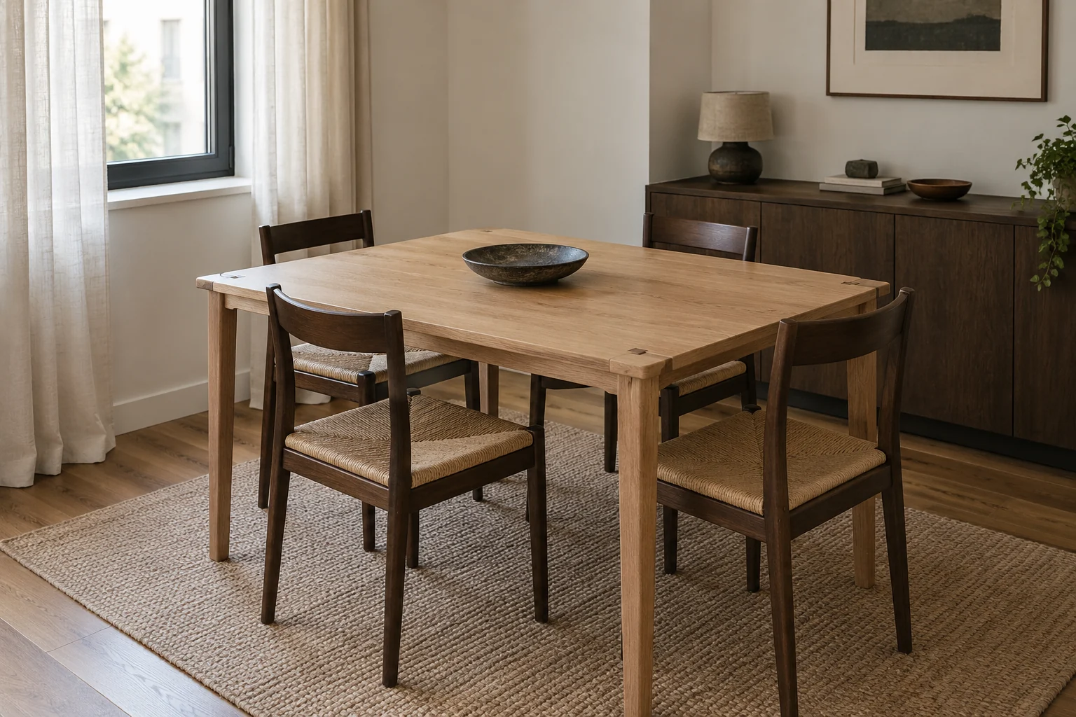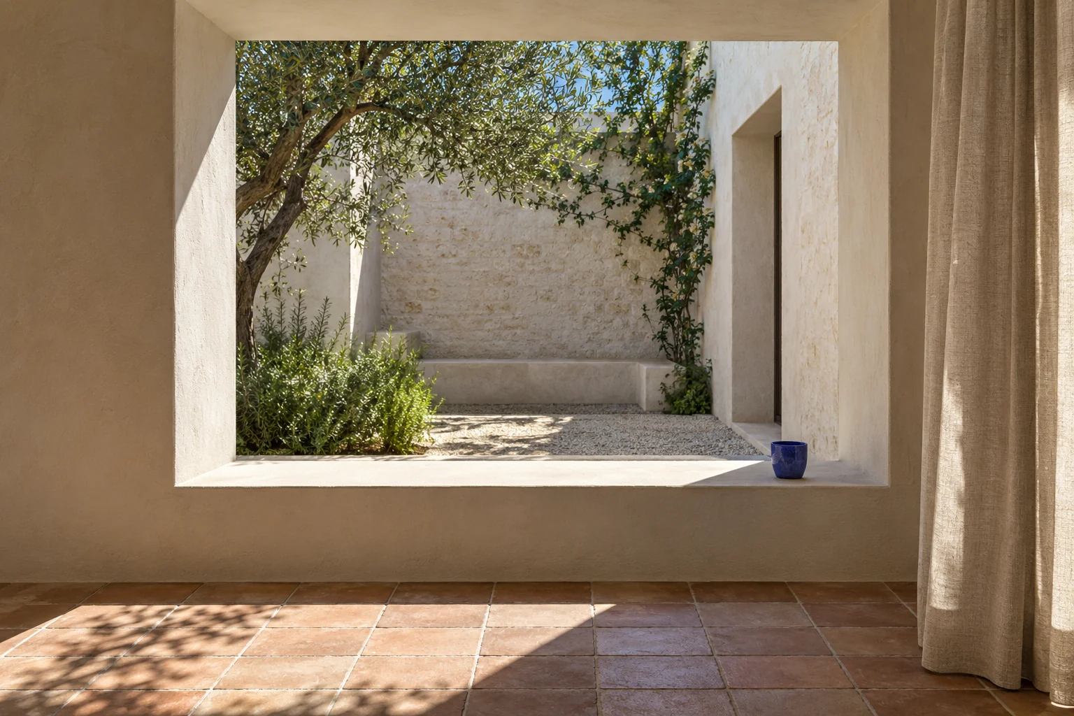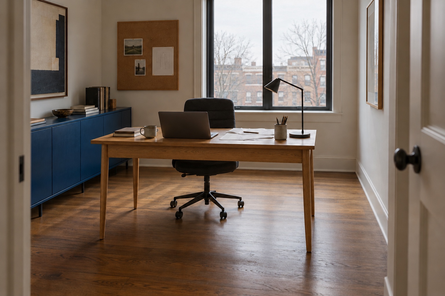
Mid-century modern interior design works best when the furniture makes a room easier to use. A low cabinet can keep a window open to view; a chair with an exposed frame can give a tight seating group some visual breathing room. Neither helps if you have to edge around it to cross the room.
The style grew from design experiments around the middle of the twentieth century, but you do not need to recreate a 1960s house. Start with the light, the route through your room and the things you actually do there. Then choose a few forms and materials that make those relationships better.
What makes an interior mid-century modern?
Look for clear shapes, visible construction and materials chosen for what they can do. Molded plywood made a curved chair possible; a slim metal frame could support a seat without a heavy wooden base. The appeal is not simply that these objects look old. It is that their shape and making are legible.
There was never one official mid-century palette or a single national version of the style. MoMA’s 1941 Organic Design exhibition put material, structure and purpose in conversation; The Met’s account of design from 1950 to 1975 shows how new manufacturing methods and different cultures shaped the work that followed. Those histories are more useful than a checklist of atomic clocks and orange cushions.
At home, ask whether a piece does its job, shows how it is made and fits the room. Those answers matter more than a room full of period references.
Mid-century modern living room: make space around the furniture
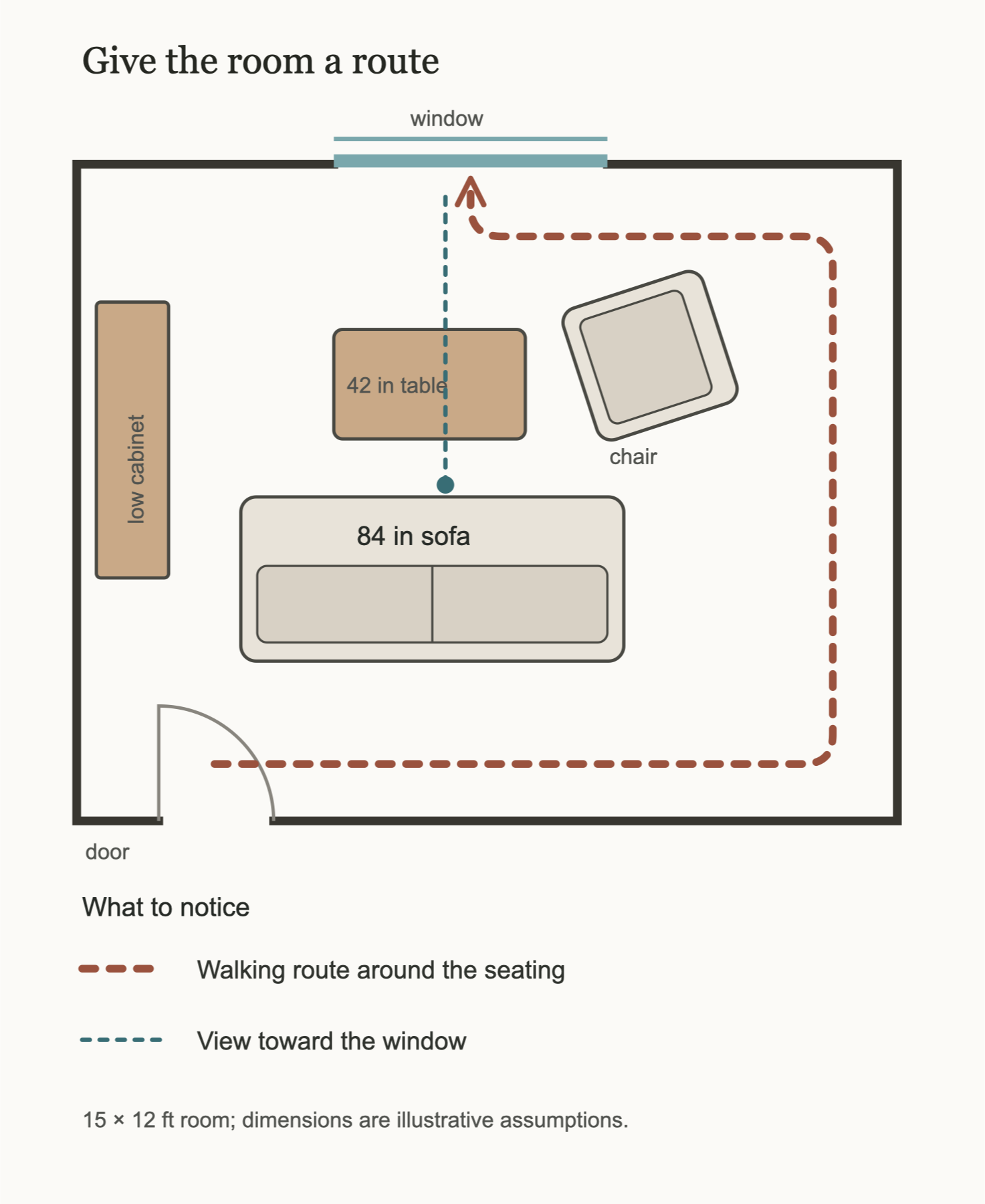
A low sofa changes the view across a room. It can let daylight and a window remain part of the composition, especially when the seating sits away from the glazing. But low is not automatically comfortable, and a narrow leg does not make the furniture’s footprint disappear.
Place the seats for conversation first. From the doorway, trace the walk to the window or next room. Put the coffee table within reach, then walk that route with a chair pulled out. If the table and passage compete, try a smaller table or two movable ones.
In a small West Village apartment, designer Suchi Reddy worked with the owners’ existing art, warm built-ins and a light palette as part of an effort to open up the home. The project is not a formula for every small room. Its useful lesson is that the furniture, wall treatment and collected pieces can support one spatial aim rather than compete for attention.
Open plan is not required. If your room has awkward doors, solve the living room layout before choosing an iconic chair for the remaining corner.
Mid-century modern furniture: let the construction do the talking
A well-proportioned piece often needs less decoration around it. Look at the edge of a plywood seat, the join between a timber rail and a leg, or the way upholstery meets its frame. Those details tell you more about the object than the word “retro” in its listing.
Charles and Ray Eames’s 1946 DCW chair in MoMA’s collection is a documented example of molded birch plywood and rubber shock mounts. It shows how a material experiment became a distinct form. It does not mean every curved plywood chair is an Eames, or that any famous chair will fit your table.
Before choosing a chair, sit in it. Check its height against your table and whether you can get up comfortably. For storage, open the drawers and examine the back as well as the polished front. A cabinet on delicate legs still needs to carry what you put in it.
Materials and a mid-century modern color palette with some nerve
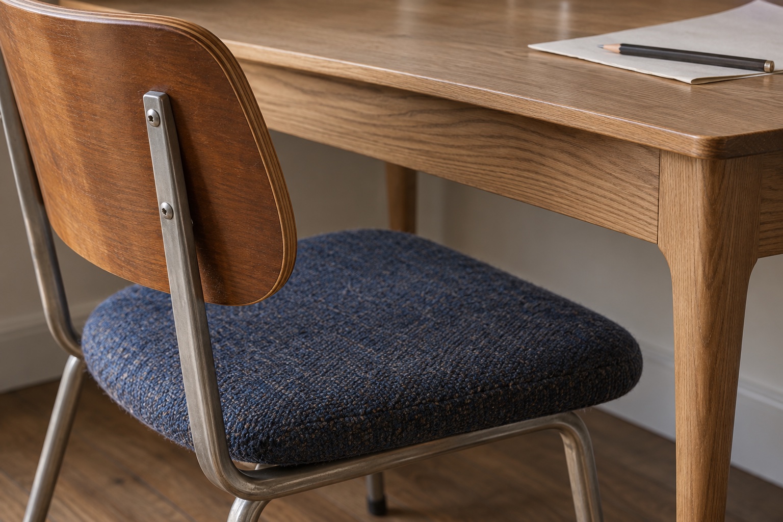
Walnut, orange and mustard make an easy shorthand, but they can turn a room into a costume. Start with the wood or floor already there. Put a sample of upholstery beside it, then add a second surface that behaves differently: brushed metal, woven wool, painted timber or molded plywood.
The V&A’s plywood history explains why the material’s layered construction mattered to twentieth-century furniture making. In a room, that edge can read as precise and light beside the irregular grain of a solid-wood cabinet. They need not pretend to be the same thing.
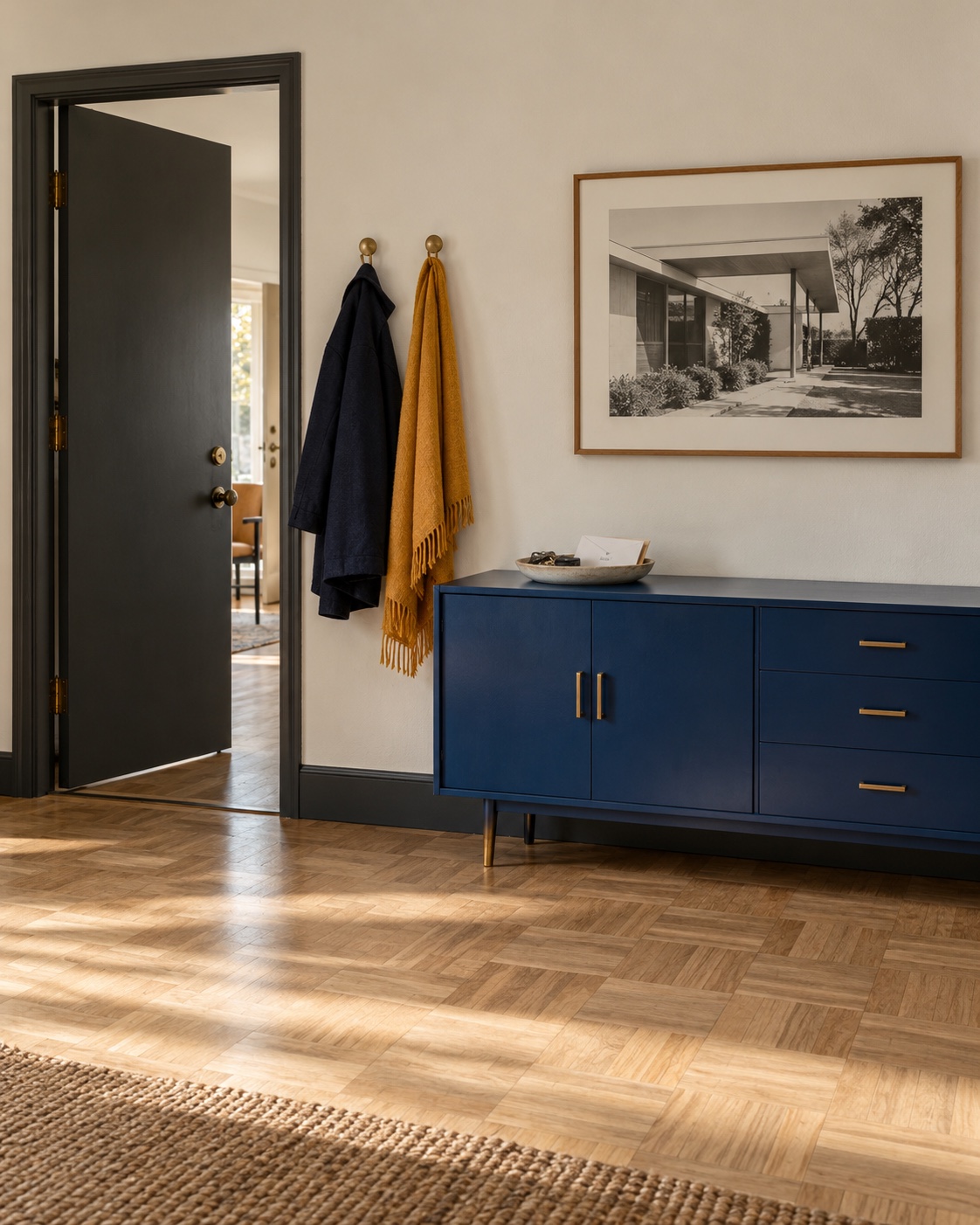
Choose color for the room you have. A deep blue chair against pale ash and a warm wall can feel more alive than another row of brown furniture. Test paint and fabric together in daylight and under your evening lamps. Their relationship matters more than the period label.
Mid-century modern lighting and art should have a job
Low, simple furniture leaves room for one expressive lamp or artwork to give the wall height and rhythm. A desk lamp still needs to light the work surface without shining into your eyes. Check its switch, cord route and shade from the seated position; a beautiful profile is less convincing when the bulb glares at you every evening.
Art does not have to come from the same decade as the furniture. In Reddy’s West Village project, a series of small hummingbird watercolors was chosen to keep the sitting area light, rather than filling the wall with a single large work. That is a useful reminder to judge art from the seat and doorway, not only on an empty wall. Our wall decor guide goes further into placement.

A mid-century modern bedroom, without making it a showroom
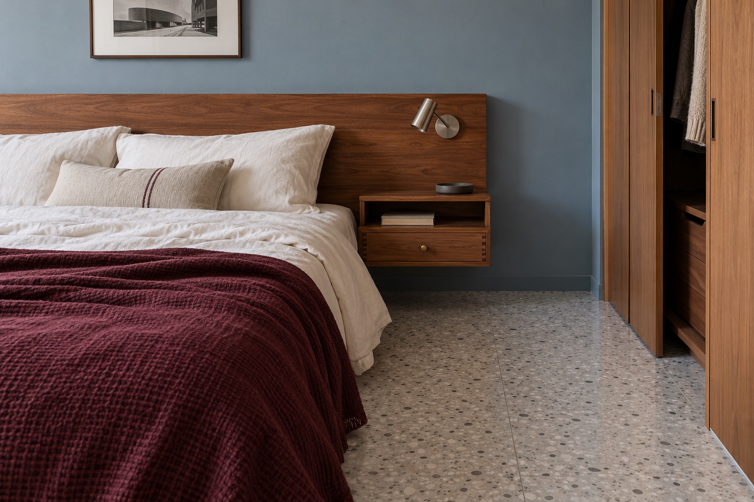
In a bedroom, the useful mid-century idea is restraint with purpose. A horizontal timber headboard can give the bed a clear place on the wall. A compact case piece can supply a drawer without making the route to the wardrobe feel like an obstacle course.
Check the ordinary movements before settling the look. Can you reach the bedside light from the pillow, open the drawer while standing beside the bed and walk around the frame? A low platform bed is not a success if it is uncomfortable to rise from. A sculptural stool is not storage unless you have somewhere else for the clothes.
Use one textile or artwork to interrupt all that straight wood. For a tight room, start with our small bedroom layout guide, then choose furniture for the space left.
How to mix mid-century pieces with the home you have
Keep the pieces that already work. An inherited cabinet can sit beside a contemporary sofa; a new lamp can light a vintage desk. Look for a shared proportion, material or color rather than a matched date on every label.
When architects Irene Vitorica Donezar and Ane González Lara renovated a Bilbao apartment, they preserved original woodwork, green marble and doors, then added new work and vintage objects from other decades. That is an observed choice in one project, not a prescription to keep every old finish. The adaptable idea is to notice what the existing home does well before replacing it with a uniform style.
If you are buying vintage, inspect its condition and ask what has been repaired. For a named design, distinguish an authenticated original, an authorized reproduction and a contemporary piece inspired by the period. Fit and comfort still matter more than the label.
Photograph the room from the doorway after moving one piece. Does the route feel clearer, and does the window still belong to the room? That is a more convincing start than matching accessories. Compare this approach with our interior design styles guide if you are still choosing a direction.
Start with one change, photograph the room and check how it feels in daily use before adding another.