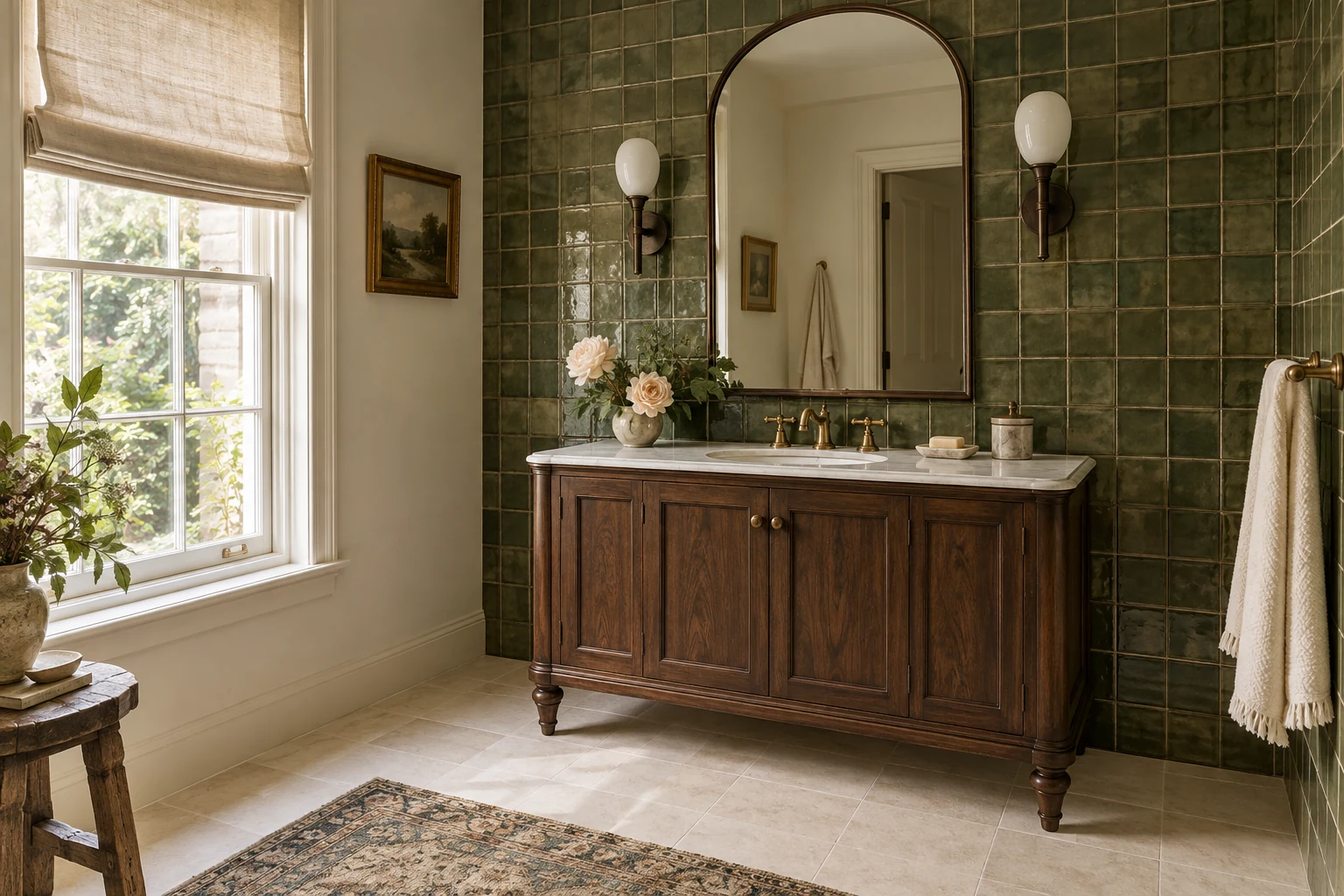
The easiest way to choose bathroom tiles is to start with one surface you love, then decide what should sit quietly beside it. That might be a green glazed wall, a checkerboard floor or a soft stone look. The floor, walls and grout do not all need to catch your eye at once.
A single tile sample makes this look deceptively easy. Then you put it beside the white basin, the vanity and the floor you are keeping, and suddenly there are six slightly different ideas of “warm white.” Before ordering, look at the group. These bathroom tile ideas show five ways to make the pieces belong together, with room for color, pattern and the practical details that are easy to miss in a saved photograph.
Maison Matière / Interior concepts. The room images illustrate material relationships, rather than documented projects or exact retailer products.
Start with the part of the bathroom that is staying
Your starting point may already be decided: a white tub, a serviceable vanity or a floor you would rather keep. Put that finish beside the tile candidates before falling in love with a completely new palette. A cream tile can be lovely on its own and surprisingly yellow beside a crisp white basin.
Then name the thing you want to notice first. If it is the wall glaze, keep the floor pattern quiet. If it is the floor, let the wall give it some breathing room. This is a useful starting point, not a ban on mixing patterns. It simply makes the next choice less mysterious.
Five bathroom wall-and-floor tile combinations
Choose a relationship you like, then adapt it around your room. The same idea can work with different tile sizes, a plainer vanity or a smaller area of color.
1. Pale large-format tiles, with a related floor
This is a good direction when you want the room to feel settled without making every surface identical. Keep the wall and floor close in warmth, then let the joints and finish distinguish them. Pale porcelain with a subtle mineral print can supply interest without a dramatic vein crossing every wall.
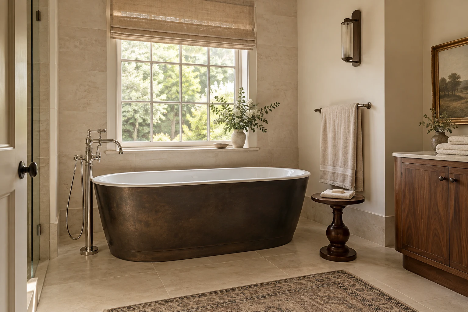
In this concept, the bronze-colored bath and walnut cabinet give the pale tile some company. The linen shade softens the window, while the visible tile joints keep the wall from reading as one blank surface. If your own room feels flat, a better mirror, light fitting or wood finish may be the missing piece; another tile pattern is not always the answer.
Before buying, view several pieces together. You are choosing the print across a wall, not the most attractive corner of one sample. If the floor already works, look for a wall tile that relates to it instead of replacing both simply to get a match.
2. Green glazed walls, with a quiet pale floor
The green wall in our opening image is doing two jobs: bringing color and changing with the light. The pale floor leaves space for both. The furniture-like walnut vanity, opal sconces and little landscape painting give the room personality without another large tile pattern. A small textile adds softness; most of the tile floor stays visible.
Judge several glazed tiles together, including the lighter and darker pieces. A little variation can be the attraction; a single sample cannot show how lively the whole wall will become. Look at it from the doorway as well as beside the basin.
For a smaller change, keep a suitable existing floor and use the green on the vanity wall. Settle its edges before choosing how much wall to cover. If you like a quieter mix of wood, simple shapes and texture, our organic modern guide develops that relationship beyond the bathroom.
3. Black-and-white floor, with plain walls
A checkerboard needs very little help. In the concept below, the dark vanity relates to the black squares while the plain walls let you read the floor clearly. Repeating a high-contrast grid up the walls would give you a busier room, even if every tile came from the same black-and-white palette.
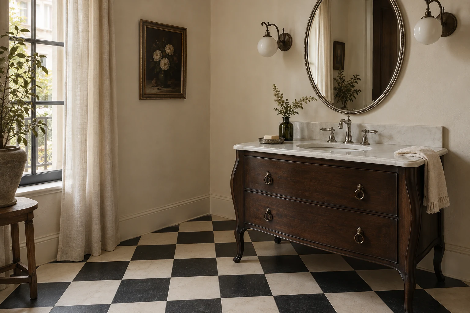
Check the size of the squares against the floor you will actually see. Much of a tiny bathroom may sit beneath the vanity or behind the door. A layout drawing will show whether the remaining pattern feels deliberate or ends in awkward fragments.
You can borrow the color relationship without retiling: a dark mirror frame or vanity detail may give an existing white bathroom enough definition. There is no need to add a checkerboard rug just to make the reference literal.
4. Warm stone-look porcelain, in different formats
Related color can connect a larger wall tile to a smaller floor tile. This is especially useful when you want the shower to belong to the room but its floor needs a different product or format.
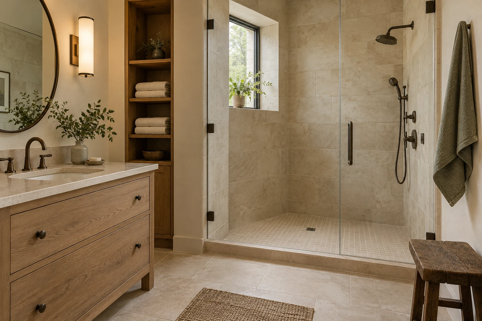
Here, the wall has broad mineral variation and the floor has a finer grid. The grout stays close to both, so the change in format is visible without becoming a dark outline around every small piece.
Stone-look porcelain is a way to explore that appearance with a different material. Compare the print repeats, texture and edge in person; do not expect a digital image to tell you whether it feels convincing. Ask for the exact product’s cleaning instructions, too. A porcelain description does not mean every surface texture will be equally easy to wipe.
For the natural-stone option, our guide to travertine flooring and bathroom tile explains what to check about the surface, intended use and care.
5. One patterned surface, with plain neighbors
If the patterned tile is the reason you are excited about the bathroom, let it have a proper area to be seen. In this small room, the floor carries the motif while ivory paneling, a white porcelain console basin and a plain linen shade keep the rest readable. The basin’s open legs also leave more of the floor in view.
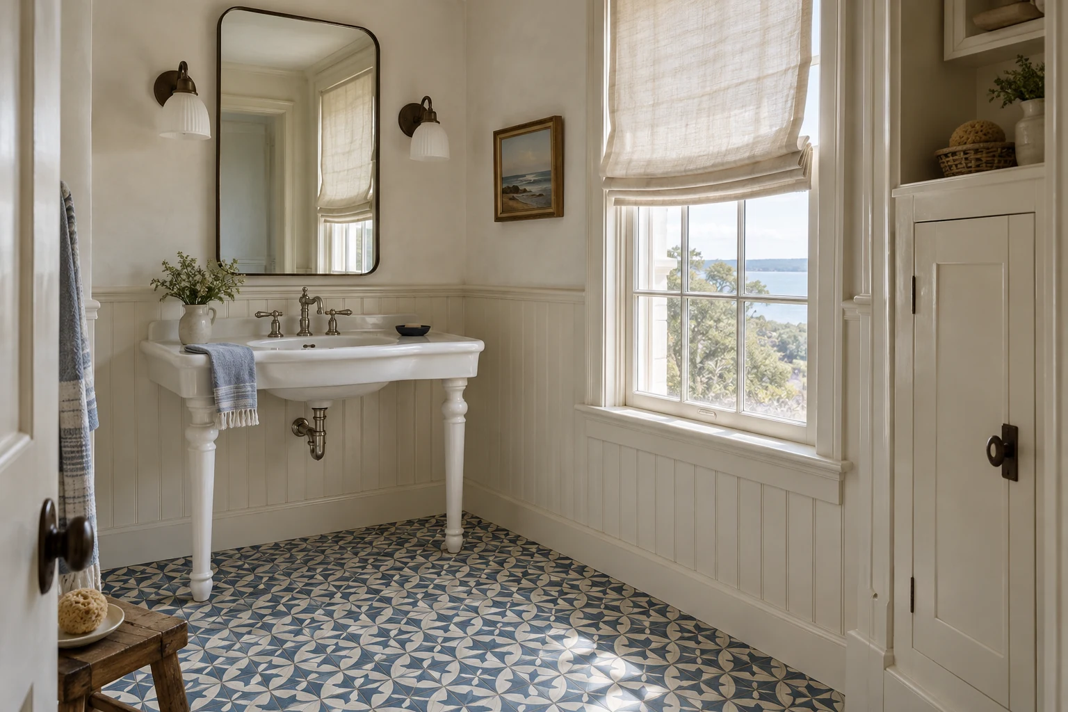
Lay out enough samples to see a repeat rather than one isolated motif. Include the floor area beside the vanity and the doorway cuts in the plan. A small sample board can make a generous pattern look much quieter than it will be across the room.
Pull one color from the floor into a towel or a small object if you want a connection above it. Repeating the complete motif on the wall is a much bigger commitment. Our nature-inspired color palettes show how a few related colors can belong together without being identical.
Which pairing suits the bathroom you have?
If you are keeping the floor, begin with a pale large-format wall tile that relates to it. Broad surfaces and subtle texture can lead the room quietly. Ask how both the tile finish and your chosen grout should be cleaned.
For more color, green glazed tile can turn a defined vanity wall into the feature. Keep the floor quieter, and look closely at the surface relief and joints before choosing a finish you will wipe every day.
A restrained black-and-white scheme draws attention to the floor grid. Check that the two tiles work together in thickness, intended use and care. If you want a smaller change, introduce the contrast through a mirror frame or vanity detail.
With a warm stone-look tile, let the mineral print do the work. Compare one wall or shower zone first, and ask whether the actual textured finish needs more attention than a smoother option.
A patterned floor works with plain neighbors that leave the motif visible. Confirm the material, coating and care routine of the exact tile. If the floor is staying, you can bring its colors into towels or another textile instead.
Before you choose, confirm the exact tile’s suitability, finish and care instructions with the supplier.
The same tile can feel quite different with another grout
Grout close to the tile color makes the joints less prominent. A contrasting grout emphasizes the grid, including the edges and cuts. Decide which effect you want before treating grout as the last small item on the shopping list. Daltile’s grout-color guide explains these approaches.
Maison Matière / Controlled visual study
Same tile. Same layout. Different grout.
Original schematic. Tile color, format, layout and joint width are held constant. Digital colors are illustrative, not grout product matches.
Notice what changed in the study: the second panel feels more drawn, although no tile has been added. If the floor is already patterned, a strongly outlined wall grid introduces another rhythm to the room. That can be enjoyable; it should be a choice you have actually seen.
Ask for a small grouted sample using your chosen tile and the proposed joint width. Look at it in the bathroom during the day and under your usual evening light. Do not pick from a color chip alone, or assume that darker grout removes the need for cleaning. MAPEI’s US palette also notes that on-screen color and installation conditions can affect the final appearance.
What size tile is best for a small bathroom?
There is no single best size. Compare the grid and the cuts on your actual walls and floor. A larger tile creates fewer joints across an uninterrupted area, but a small room with several corners, fixtures or a particular drain arrangement may need a different approach.
Our example uses the same square patch of wall twice. It makes the difference in joint lines easy to see without pretending that the bigger tile has made the wall bigger.
Maison Matière / Calculated example
One 48 × 48-inch wall area
Hypothetical 16-square-foot wall. Nominal modules; joint width, cuts and perimeter joints are excluded. This counts lines, not grout quantity, cleaning time or installation cost.
How we counted the lines
The small grid has 12 columns and 12 rows: 11 vertical plus 11 horizontal internal lines, each 48 inches long. That is 1,056 inches, or 88 feet. The larger horizontal modules make 2 columns and 4 rows: 1 vertical plus 3 horizontal lines, totaling 192 inches, or 16 feet.
The smaller grid gives you a more frequent rhythm and more joints to account for. The larger grid gives the tile surface more uninterrupted space. Neither result tells you which one is right for your bathroom.
Now make a quick elevation or ask your installer for a layout. Check what happens at the mirror, tub edge, doorway and any niche. A beautiful big tile divided into thin slivers beside the vanity may be less convincing than a modest size that fits the wall neatly.
What color tile is best for a small bathroom?
Start with the fixed finishes and the amount of color you want to see. A pale floor with a colored wall is one useful option, as the green concept shows. A darker room can also feel inviting; a light tile is not a guarantee that it will feel spacious.
Stand the wall samples upright, put the floor samples flat and include the basin white. If you are keeping a patterned floor, try a plainer wall before adding another color. If the bathroom lacks daylight, make the evening-light test part of the decision rather than an afterthought.
Should wall and floor tiles match?
They can, but they do not have to. Related undertones or a shared color can connect different formats. In the warm stone-look study, larger wall tiles and smaller floor tiles belong together without sharing the same grid.
Matching everything is only useful if you enjoy the finished room and each exact tile is appropriate for its location. You can keep a cohesive appearance while choosing the wall and floor separately.
Choose the layout before approving the grout
An aligned grid reads as rows and columns. An offset arrangement adds a stepping rhythm. Compare both with your proposed grout: strong contrast makes that difference harder to ignore.
Visual comparison only. Tile size and manufacturer instructions determine which offsets and joint widths are suitable for the installation.
Then look at the places the tile ends: the top of a half-height wall, an outside corner, the tub apron and the doorway threshold. Ask to see the proposed cap, trim or finished edge beside the tile. A matching color does not always mean matching thickness or a usable edge piece.
If you want the room to keep feeling like you, choose the relationship rather than a promise of a tile that “never goes out of style.” A familiar checkerboard and a bolder green wall are both reasonable choices when their neighbors, edges and upkeep make sense.
Give the shower floor its own check
A tile that works on the wall is not automatically a shower-floor choice. Check the manufacturer’s stated applications for the exact tile and size, then discuss the finish, wet-use suitability and drain layout with your installer. Daltile’s application guide distinguishes these intended uses.
The smaller floor pieces in our shower concept illustrate a material relationship. They do not establish that an actual product is suitable for your shower. A matte appearance, a small format or a photograph of water on a tile cannot settle that question.
The construction behind the surface matters as well. Tile and grout alone do not make a shower waterproof; the assembly needs an appropriate waterproofing approach. Schluter’s shower-waterproofing explanation is a useful starting point for that conversation.
A useful US sample edit
Start with the missing decision, not a cart full of materials. These are ordinary sourcing links, not approved affiliate links or exact matches to our concepts. We have not tested the products.
- For the green-wall direction: TileBar’s sample collection includes Portmore Green 4×4. Compare several pieces for glaze variation, then read the exact tile’s permitted applications and edge options. It is a starting point for the color relationship, not the tile shown in our image.
- For a quieter stone look: Daltile Dignitary in Eminence Grey offers a porcelain interpretation of limestone. This named color is a grayer alternative to our warm concept. View a larger selection of pieces and check the specific format’s use and care information.
- For the grout decision: use MAPEI’s US grout palette to shortlist a similar tone and a contrasting tone, then request a physical comparison or grouted sample. The color choice and the choice of grout product are separate decisions.
If no tile replacement is needed, take a photograph from the doorway and try the color relationship with towels, a mirror frame or a small accessory. You may find that the tile you already have only needs better company.
Before you order, try the whole group
Our kitchen-material guide uses the same useful test: samples should face the way the finished surfaces will. A wall tile lying flat on a table cannot show you exactly how its glaze will catch light on the wall.
- Include what stays. Put the basin white, vanity finish and existing floor in the comparison.
- Choose the leading surface. Check the group from the doorway, not just close up.
- See the grout in place. Compare a grouted sample at the proposed joint width in daylight and evening light.
- Resolve the cuts and edges. Check the layout around fixtures, the threshold and every visible end of the tile.
- Confirm use and upkeep. Get the exact tile, grout and installation requirements before comparing complete quotes.
The best combination is one you can explain simply: this is the tile I want to notice, these finishes sit comfortably beside it, and these are the details we have checked. After that, choosing the hand towel should feel pleasantly uneventful.
Start with one change, photograph the room and check how it feels in daily use before adding another.