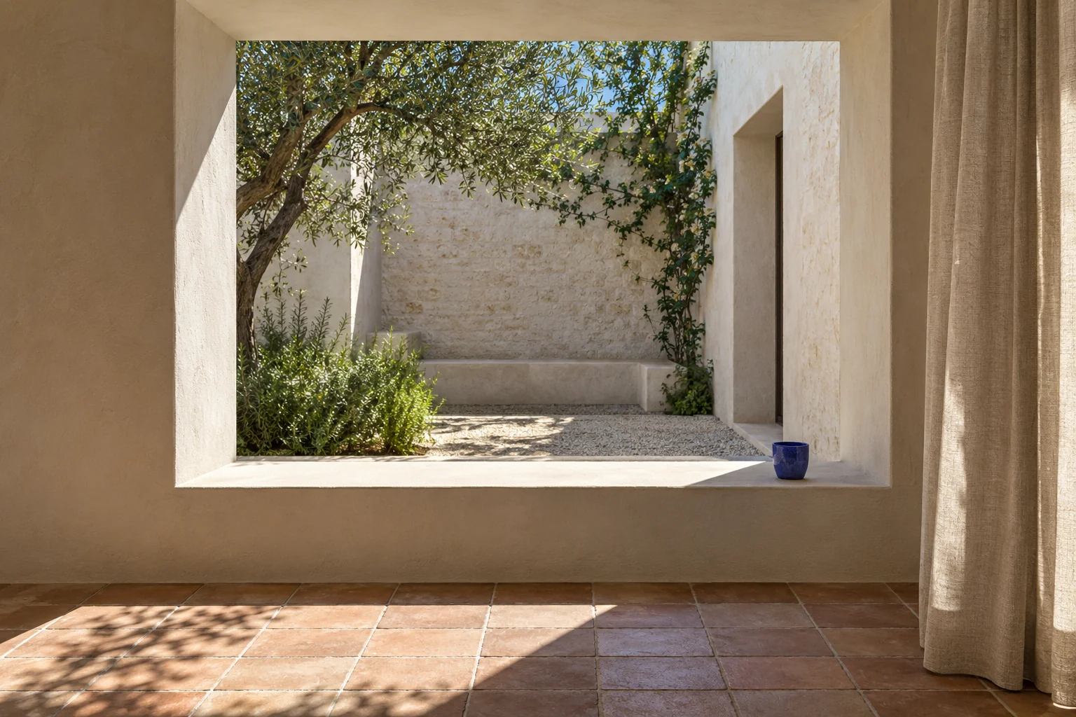
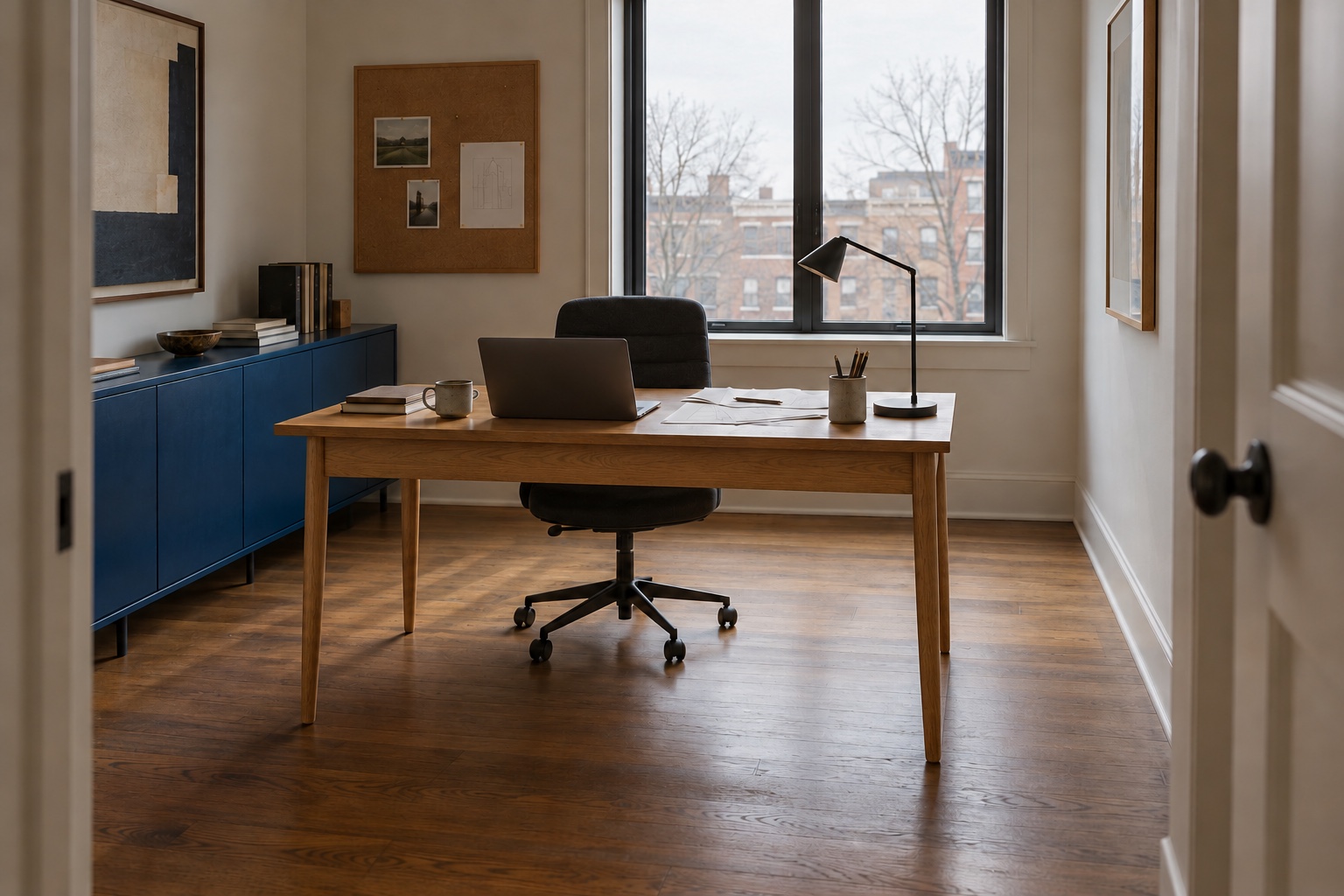
Organic modern interior design combines simple contemporary forms with natural-looking texture, warmth and a little irregularity. Think of a clean-lined sofa beside a grainy timber table, or a quiet wall behind a handmade ceramic. The interest comes from the relationship between them.
You do not need an all-beige room, a curved sofa or a new collection of accessories to get there. Start with what already works in your home, then use material, colour and shape to give the room a clearer direction. This guide explains the style and shows how to apply it without losing comfort or personality.
What is organic modern interior design?
The modern part is the structure: uncomplicated furniture, useful circulation and a composition with room to breathe. The organic part is the variation: wood grain, woven cloth, earthy colour, rounded edges and objects that do not look mechanically identical.
The label is a decorating shorthand, not a certification or a rulebook. A room can express it with a few well-chosen relationships. A smooth cabinet becomes more interesting beside a textured lamp; a softly curved chair reads clearly against a straight window frame. If every object is rustic, the modern structure gets lost. If everything is smooth and pale, the room can feel unfinished.
A useful starting point: keep the biggest shapes simple, add texture where you touch the room, and give one or two objects permission to be expressive.
Choose a palette with depth, not just pale colours.
Begin with the floor and the largest piece of furniture you intend to keep. These occupy more visual space than a cushion or vase. Put wall samples, fabric and wood finishes next to them in daylight and under your usual evening lights. A creamy white can look yellow beside one floor and pleasantly warm beside another.
For an organic modern living room, try one of these relationships:
- Warm white, honey wood and charcoal: a light background with a clear darker outline.
- Oat, walnut and muted olive: a deeper timber tone with a subdued colour that keeps the room from becoming a beige collection.
- Stone, pale oak and clay: a quieter timber finish with a small warm colour note.
These are our illustrative colour families, not exact paint matches. Use the diagram as a relationship to test, then choose actual samples. Repeat the darker or coloured note in a few separate places so it belongs to the room rather than appearing as a single accidental object.
Three material and colour directions
Warm + defined
- Warm white
- Honey wood
- Charcoal
Soft + grounded
- Oat
- Walnut
- Muted olive
Light + earthy
- Stone
- Pale oak
- Clay
If your sofa is gray, navy or green, keep it. Select a texture and wood tone that sit comfortably beside its undertone, then borrow one colour from it for the art or textiles. The style does not require replacing a useful sofa with a cream one. Our nature-inspired colour guide offers other combinations to test.
Let materials do different jobs.
A room gains depth when its materials behave differently. Wood can supply a visible grain; a woven textile softens the seat; ceramic adds a smaller, irregular surface; glass or metal introduces a precise edge. Choose the combination for contrast rather than collecting every material associated with the style.
On a coffee table, ask how the surface will handle your actual routine. A natural stone top may need different care from a sealed wood or engineered surface. Check the maker’s guidance for the specific finish before assuming that a material is easy to maintain. An attractive veneer is not automatically a poor choice, and a solid wood description is not enough to establish the quality of the entire piece.
In a bathroom, try the same material contrast with a quiet floor and a glazed wall, or a warm stone look in related formats. Our bathroom tile combinations explain how grout and neighboring surfaces change the result.
For upholstery and rugs, request samples and read the fibre content and care instructions. Sit against the fabric, look at the weave and consider pets, food and the time you can spend cleaning. The visual appeal of a loose, textured weave may come with a maintenance trade-off. Make that choice consciously.
Natural-looking is not the same as responsibly sourced. If timber sourcing matters to you, look for a specific product claim rather than a general collection description. The Forest Stewardship Council explains its three labels, which identify different material sourcing categories. A style name or earthy colour tells you nothing about that certification.

In this detail, a darker chair and a grainy timber surface give the pale ceramic a clear outline. Use the same contrast test with samples you already own. If the furniture is competing with the route through the room, settle the awkward living-room layout before choosing another statement piece.
Balance soft shapes with a clear structure.
Choose furniture around the people using the room. A low sculptural sofa may photograph well but feel awkward to get out of; a deep seat may suit lounging and frustrate someone who prefers to sit upright. Test seat height, depth and support before choosing a silhouette.
Then decide where a curve will help. A rounded coffee table can soften a straight seating arrangement. An arched chair back can provide one expressive shape beside a rectangular cabinet. You do not need curves in the sofa, table, mirror, rug and lamp simultaneously.
Give each large piece a clear role. If the room needs flexible seating, an independent chair may be more useful than a larger sectional. If the main route is narrow, a visually delicate piece still occupies its full physical footprint. Compare the options in our small living-room layout guide before adding furniture.
Add an evening setting.
Natural texture changes with the light falling across it. Look at the room after dark as well as in daylight. A single bright ceiling source may flatten the materials you chose so carefully, while a lamp placed for reading gives a seat a useful evening purpose.
Use light for a surface or activity: a table lamp beside a reading chair, a pendant related to the dining table, or an aimed source for a favourite artwork. Keep the fixture forms relatively quiet if your furniture already has strong shapes. Before buying more lamps, read our four lighting placement fixes.
Apply the idea to the room you have.
In the living room
Keep the sofa and choose one material contrast around it. If the upholstery is smooth, a textured rug or woven cushion can supply variation. If the sofa is already heavily textured, a simple table and quieter textiles may be enough. Finish with an artwork you want to live with rather than a print selected only to match the cushions.
In the bedroom
Let bedding, a headboard and a bedside surface carry the material story. Preserve the space needed to open drawers, change the bedding and reach switches. A pair of matching nightstands is optional; convenient use from each side of the bed matters more than perfect symmetry.

For a compact bedroom, use our small bedroom ideas to check bed access and storage before deciding on the bedside furniture.
In a rental or a compact home
Work with reversible layers: curtains, a rug, lighting, movable furniture and art. Repeat a timber tone you already own instead of adding several competing woods. Keep the window and main route usable. A smaller room can express the style through texture and proportion without feature walls or built-in cabinetry.
Three mistakes that make the room feel less personal.
- Making every surface the same pale tone. Add a darker outline or a richer material so the furniture still reads as distinct shapes.
- Buying texture without checking care. The room should suit your life. A practical fabric in a natural-looking colour can be a better decision than a delicate material you will worry about daily.
- Removing everything with a history. Books, a familiar chair and a piece collected on a trip can give the room a point of view. Edit their arrangement instead of replacing them with anonymous accessories.
Two places to start a US shopping comparison.
Buy for the missing role in the room. These category links help you compare dimensions, construction and care; they are not the exact products shown in our illustration. We have not tested the products. These are ordinary retailer links and do not currently earn Maison Matière a commission.
Start with one relationship.
Photograph the room from the doorway. If several activities compete, compare our living room layout ideas first. Name what feels missing: warmth, contrast, softness or a clearer layout. Choose one change that addresses it. That might mean moving a dark lamp, bringing an existing wooden chair into the room or sampling a curtain beside the wall colour.
Live with the adjustment before making the next purchase. Organic modern design works best when simple structure and material warmth support the home you actually use.
Continue with curtain ideas for light and softness, living room wall decor, or compare Japandi interiors and everyday use. The interior design styles guide brings the related directions together.
Sources and editorial notes.
This is a Maison Matière style interpretation, with original illustrative palettes and interior concepts. It is not a documented home, product test or environmental certification. FSC label guidance and linked US retailer categories were checked on 3 October 2026. Read the construction, care and sourcing information for the exact product you select.
Start with one change, photograph the room and check how it feels in daily use before adding another.