

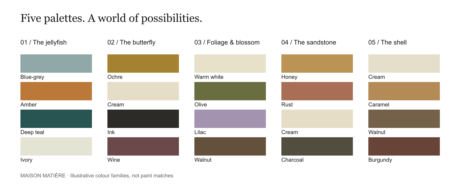
A jellyfish against deep water. A dark line across a butterfly’s wing. The pale ridges of a shell. Nature offers more than a list of attractive colours: it shows us contrast, repetition and the relationship between a quiet background and a small, striking detail.
The useful question is not simply, “Which colours should I copy?” It is, “What is each colour doing?” These five nature-inspired colour palettes, drawn from the Maison Matière video, turn that question into practical decorating choices.
Watch / 23 seconds
From nature to the room
Five colour relationships to borrow, adapt and test in your own home.
Illustrative room scenes from the Maison Matière video, not documented design projects. The written guide explains each palette.
How to turn a nature photograph into a room palette
Choose one image, then look for four roles. A background holds the scene together. A supporting colour gives it substance. An accent draws your eye. A dark or light contrast makes shapes easier to distinguish.
These roles do not have to become four paint colours. Timber, stone, upholstery, metal, artwork and the view through a window already contribute to the room. Start with the things that will stay, particularly a floor, sofa or large cabinet, before adding anything new.
Give the colours different amounts of space. You might begin with a broad, quiet background, one substantial supporting tone and a few smaller accents. Treat that as an experiment, not a fixed percentage rule: a richly coloured room can work beautifully with a different balance.
1. Jellyfish: blue-grey, amber, deep teal and ivory
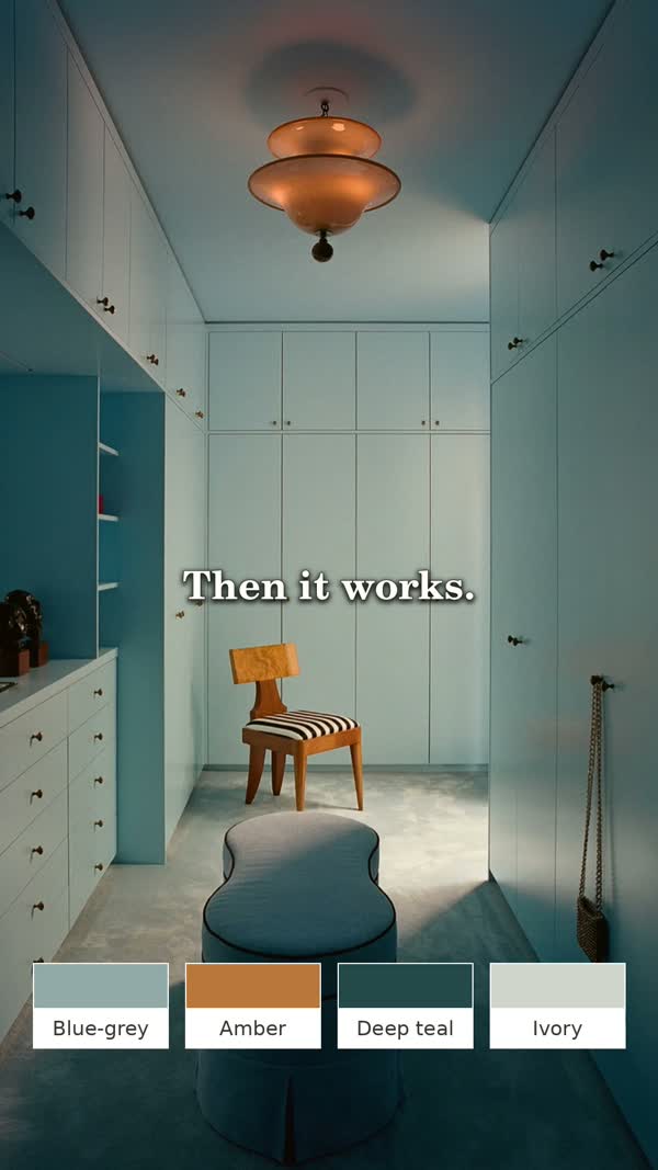
Illustrative frame from the Maison Matière video. Digital colour families, not exact paint matches.
The palette: Blue-grey · Amber · Deep teal · Ivory
The jellyfish pairing is about a warm focal point against a cooler setting. In the video, the translucent amber form becomes an amber light fitting, while the surrounding water suggests blue-grey and deeper teal. You do not need an ocean theme to use that relationship.
Put it in a room: try blue-grey on a wall or built-in cabinetry, ivory on a larger textile, and deep teal on one upholstered piece. Let amber appear in a lamp, glass object or artwork. The material matters: coloured glass gives a different effect from an opaque orange cushion.
If you want a quieter version: keep the walls ivory and bring in blue-grey through curtains or bedding. Repeat teal once or twice in small details, then use amber as the noticeable exception.
Watch for: giving every surface the same blue-green intensity. Compare a pale sample, a middle tone and a distinctly darker one so that the furniture does not disappear into its background.
2. Butterfly: ochre, cream, ink and wine
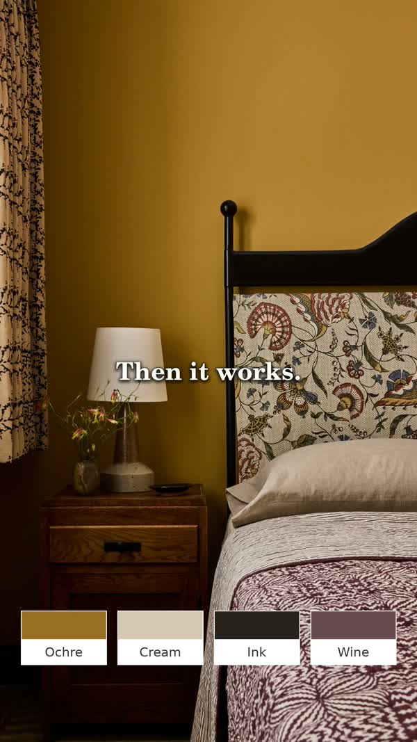
Illustrative frame from the Maison Matière video. Digital colour families, not exact paint matches.
The palette: Ochre · Cream · Ink · Wine
The butterfly’s yellow and dark markings suggest a lesson in outlines. The bedroom interpretation uses ochre as the surrounding colour, cream for breathing space and a dark bed frame to draw a clear shape. Wine is an additional decorating accent in the room palette, not an exact colour match to the wing.
Put it in a room: choose one ochre element to lead, such as a wall, curtain or upholstered chair. Set it beside cream, then add a few deliberate ink-coloured lines: a frame, a lamp base or furniture legs. A wine-coloured cushion or patterned textile can add another layer without becoming a second dominant colour.
If you rent: the wall can stay neutral. Use ochre in a bedspread or artwork, keep the larger bedding cream and repeat the dark outline in existing furniture.
Watch for: choosing the yellow only from a glowing screen. Compare physical samples beside the wood and fabrics you already own before deciding whether you prefer a cleaner yellow or an earthier ochre.
3. Foliage and blossom: warm white, olive, lilac and walnut
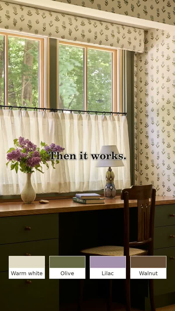
Illustrative frame from the Maison Matière video. Digital colour families, not exact paint matches.
The palette: Warm white · Olive · Lilac · Walnut
Here the interest is in a small, unexpected colour. Olive and walnut can establish a familiar, earthy setting; lilac interrupts it gently. The video connects pale blossom and green leaves with a dining space, showing that a nature-inspired room need not be entirely green and beige.
Put it in a room: begin with warm white around the room, olive on a cabinet or substantial textile, and walnut through furniture. Introduce lilac in flowers, a vase, table linen or a small upholstered detail. It can be the least abundant colour and still be the one you remember.
Use what you have: if your table is oak rather than walnut, keep it in the sample group and test the green beside it. The aim is a relationship that suits your home, not a shopping list that requires replacing every piece.
Watch for: choosing the white in isolation. Put it next to the green, timber and lilac sample together; a “neutral” still changes how the other colours read.
4. Sandstone: honey, rust, cream and charcoal
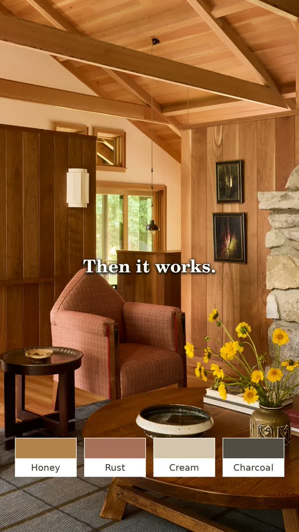
Illustrative frame from the Maison Matière video. Digital colour families, not exact paint matches.
The palette: Honey · Rust · Cream · Charcoal
Layers of sandstone suggest a palette built from related warm tones, with a darker edge to stop everything blending together. In the video, honey-coloured timber does much of the work. The room does not need every wall painted to feel richly coloured.
Put it in a room: count exposed beams, flooring and timber furniture as part of the honey element. Add rust through upholstery or a rug, cream through a broader textile, and charcoal through a small table, frame or lamp.
For a less timber-heavy room: keep a cream background and use honey and rust in two movable pieces. You can test the combination before committing to a large sofa or a roomful of joinery.
Watch for: adding more orange simply because the palette feels warm. If the floor and cabinetry are already golden, your next useful addition might be cream or a darker contrast rather than another warm mid-tone.
5. Shell: cream, caramel, walnut and burgundy
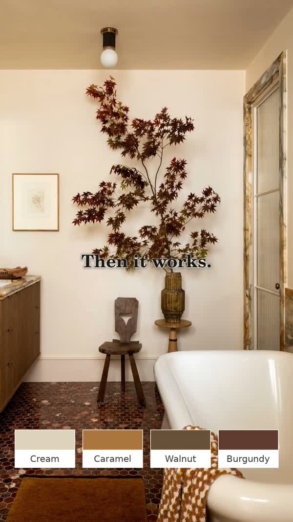
Illustrative frame from the Maison Matière video. Digital colour families, not exact paint matches.
The palette: Cream · Caramel · Walnut · Burgundy
A shell offers pale ridges, warmer bands and darker seams. The room interpretation extends those layered neutrals with a burgundy accent. This is a useful direction when you like a mostly neutral interior but want something more deliberate than several nearly identical beiges.
Put it in a room: let cream occupy the broadest surface, then introduce caramel through a textile, tile or decorative object and walnut through timber. Keep burgundy concentrated in one or two details, such as artwork, towels or a vase.
Start small: in an existing cream bathroom, try the relationship with towels and an object before changing permanent finishes. If the stone has a pink, yellow or grey cast, include it in the comparison rather than assuming that any cream will match.
Watch for: confusing a colour reference with a material specification. An image can suggest a palette, but it cannot tell you whether a surface is suitable for a wet area or how it should be maintained.
Test the palette where you will actually live with it
Bring the candidates together: a paint sample, fabric, a piece of timber or a photograph of a fixed finish. Look at the group against the surfaces that are staying. If a colour feels wrong, first ask whether the problem is the hue, how light or dark it is, or simply the amount of it.
Then test the paint physically in the room. Benjamin Moore recommends checking colour samples under natural and artificial light and at different times of day; movable sample boards let you compare locations. Its guidance also notes that on-screen colour can differ from actual paint. Read the manufacturer’s sampling advice.
Our swatches illustrate colour families, not purchasable paint shades or exact matches. Do not order paint from a screenshot or a digital colour value alone. Make the final decision with physical samples and the actual finish you intend to use.
Begin with one small change
You do not have to redecorate a room to try a palette. Keep the main surfaces as they are and introduce one missing role: a dark outline, a lighter textile or a single contrasting accent. Photograph the result, then compare it with your reference. Is your eye going where you intended?
The strongest nature-inspired interiors do not recreate a landscape literally. They borrow a relationship and make it useful at home.
Editorial interpretations of the five palettes in the Maison Matière video, “Colour Palettes from Nature.” Room images are illustrative frames, not documented project case studies. Colour names describe families rather than specific paint products. Practical paint-sampling guidance checked against Benjamin Moore’s published advice on 2 October 2026.
Start with one change, photograph the room and check how it feels in daily use before adding another.